For even more diversity: We adapt colorful UFA logo
10.09.2021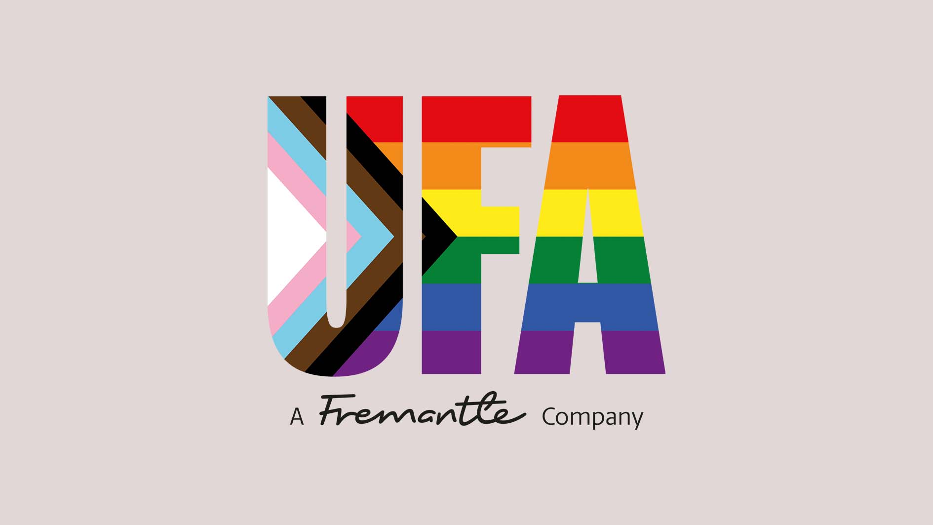
UFA takes its responsibility towards employees, partners, viewers and clients seriously, wants to serve as a role model and aspires to actively live diversity, inclusion, equal opportunities, tolerance and democratic values. We communicate this attitude to the outside world through a variety of initiatives and measures, whereby a colorful UFA logo supports us in our external image.
In order to address everyone with a colorful UFA logo and not exclude anyone, a progress flag was added to the logo. The bright colors not only stand for the LGBTIQ+ community, but also place a special focus on trans people and people of color.
Markus Schroth, member of the UFA Diversity Circle: “The addition to the rainbow flag is intended to show that we are open to a diverse society and do not exclude anyone. The wedge symbolizes that a lot still needs to be done. Even though we have already achieved a lot and have launched great initiatives together with the be.queer network, I am always shocked at how a tolerant and open society is still being prevented, not only in other countries, including European countries such as Hungary. With a new colorful UFA logo, we are therefore sending a clear signal to the world at exactly the right time.”
Even though the rainbow flag is representative of the entire LGBTIQ+ community and is known all over the world, it is far from being the only one. The range of flags has constantly expanded over the course of the Pride movement. Today, there are flags that symbolize all possible genders and sexual orientations. The “Progress Flag” was designed by the non-binary graphic designer Daniel Quasar. In addition to the colors already used in the LGBTIQ+ flag, a wedge with additional colors was added. For more information and the individual meanings of the colors, we recommend the flag dictionary from CSD Germany:https://csd-deutschland.de/flaggenlexikon/